
Content design/UX writing samples
Table of contents
Content design principles
As the first full-time UX writer ever at Achieve, I’ve advocated for UX writing and content design at every opportunity. When I had a chance to meet the design and research team in person at our UX summit, I created this slide to help inform them about what content designers do and the guiding principles from which I operate.
Later, I’ve used this visual multiple times in front of executives, product managers, and other collaborators to communicate how I ensure content is not only clear and concise, but actionable, human, and helpful.

Design process
I worked closely with designers, UX researchers, product managers, and developers in a triad collaboration process. Our collaborative relationships were based on mutual respect and openness to grow and learn from each other as we worked to achieve the same goal. Here’s the presentation I gave at a UX Summit with Roxy (research) and Gary (design) about how I collaborate with the design team and within our triad process as a content designer.


Microcopy
Messaging in small doses to inform and motivate to take action (error message examples).

Error messages - GOOD (Get Out of Debt) app
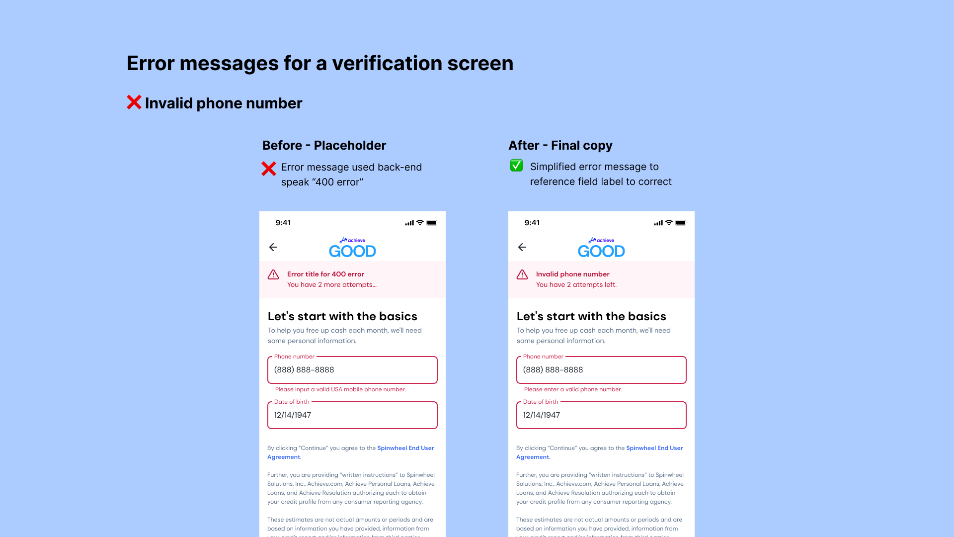
Error messages - GOOD (Get Out of Debt) app

Error messages - GOOD (Get Out of Debt) app
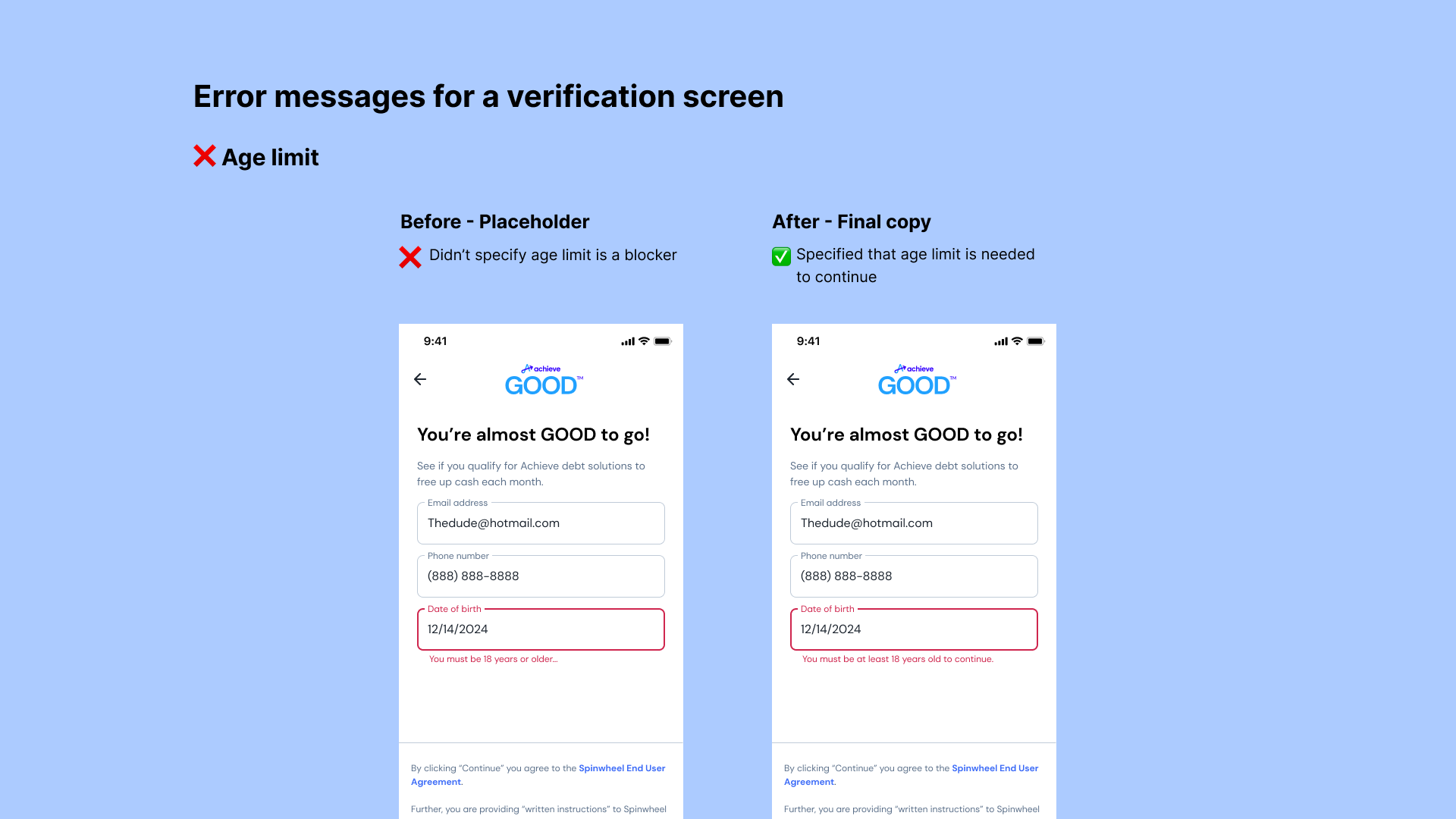
Error messages - GOOD (Get Out of Debt) app

Error messages - GOOD (Get Out of Debt) app
Re-engagement
Re-connecting with users to recapture their attention and continue converting.

Data visualization
Communicating data to show information and trends to help make quick and clear decisons.
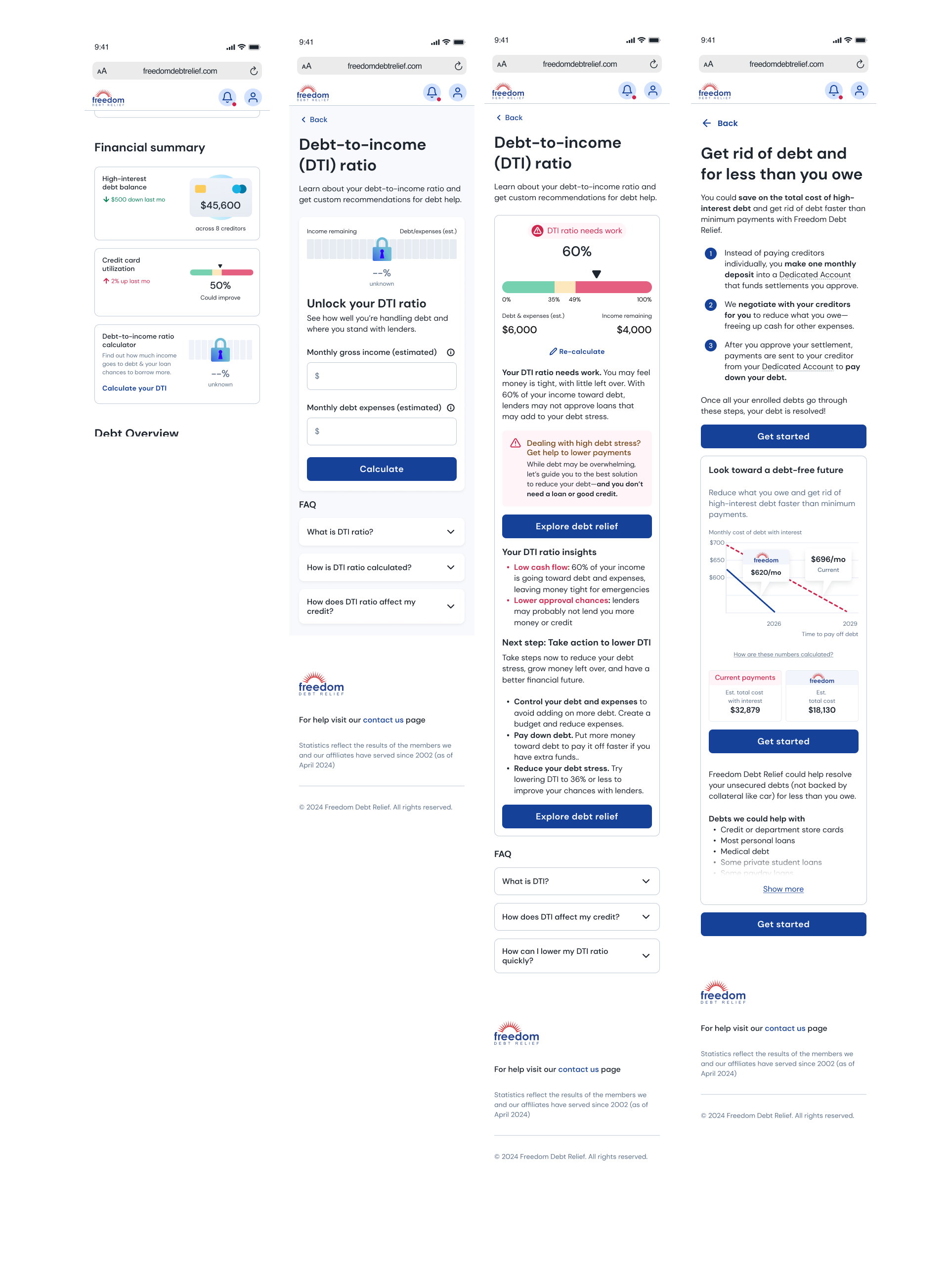
Debt-to-income calculator
Debt Fit Quiz


Personal loan product page

Debt payoff calculator


User research
Delving into user insights, from usability to A/B tests.
Finance app
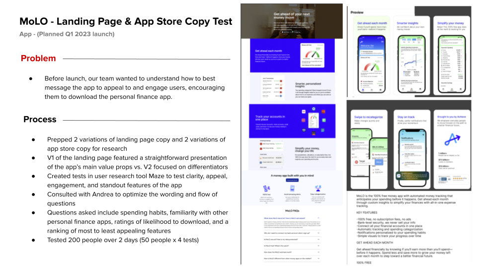
About the test
• Test/content type: Unmoderated landing page & app store copy test
• Product: Money Left Over (MoLO) personal finance app
• Tools: Maze, Google Sheets, Google Slides
What I did
• Wrote and prepared the copy variations for the prototypes
• Created the test plan and set up 4 content tests (2 variations per landing page and app store copy) in Maze
• Consulted with our UX researcher on flow and wording of test questions
• Analyzed responses from 200 participants
• Wrote and presented results deck
Impact of research
• Revised the landing page & app store copy:
° Reordered the information architecture of the landing page
° Recommended less complicated app visuals that highlighted app simplicity
° Focused on most appealing user benefits
° Launched the app successfully


Usability test
About the test
• Test/content type: Unmoderated usability test of two concepts:
• V1 (Bar) segmented bar visualization with more detailed information
• V2 (Half Circle) half circle visualization with less information
• Product: Member Experience (MXP) dashboard and debt-to-income ratio calculator
• Tools: Usertesting, Figma, Google Sheets, Google Slides
What I did
• Wrote and prepared the copy variations for the prototypes
• Updated the original test plan with refined questions
• Analyzed responses from 12 participants
• Wrote and presented results deck to stakeholder group
Impact of research
• Data viz winner: segmented bar
• Updated FAQs to mitigate confusion around how to track DTI, how to improve DTI, and how DTI is calculated
• Update copy to have more encouraging or positive language on the high DTI result for users easily discouraged by less than ideal financial situations

CTA button test
About the test
• Test/content type: Unmoderated CTA button test to determine whether Blue vs. Red CTA button colors were most appealing and button microcopy
• Product: Freedom Debt Relief website
• Tools: Maze, Figma, Google Sheets
What I did
• Wrote and prepared the Blue vs. Red variations in Figma for the prototypes, including the clickable prototypes to determine user paths
• Created the test plan and set up 2 content tests (1. Blue first, Red second, 2. Red first, Blue second)
• Consulted with our UX researcher on flow and wording of test questions
• Analyzed responses from 30 participants
• Presented insights to stakeholder group
Impact of research
• Kept CTA for “Client Dashboard” in nav over “Client Login” for the most clear CTA
• Used most appealing CTA microcopy “Get started” and “Get debt help now” on multiple websites
• Kept blue CTAs for the main brand pages

5-second test
About the test
• Test/content type: Unmoderated 5-second test that was part of the main CTA button test to determine whether participants understood the main call to action and if the button color, messaging, or images were memorable.
• Product: Freedom Debt Relief website
• Tools: Maze, Figma, Google Sheets
What I did
• Wrote and prepared the Blue vs. Red variations in Figma for the prototypes, including the clickable prototypes to determine user paths
• Created the test plan and set up 2 content tests (1. Blue first, Red second, 2. Red first, Blue second)
• Consulted with our UX researcher on flow and wording of test questions
• Analyzed responses from 30 participants
• Presented insights to stakeholder group
Impact of research
• Used most appealing CTA microcopy “Get started” and “Get debt help now” on multiple websites
• Kept blue CTAs for the main brand pages

Moderated preference test
About the test
• Test/content type: Moderated test to determine which Home page Hero concept was more appealing:
• Concept 1 (Current) slider with an updated image
• Concept 2 (Offer) offer presentation table without an image
• Product: Freedom Debt Relief website
• Tools: Usertesting, Figma, Google Sheets
What I did
• Wrote and prepared the “potential offer” variation in Figma for the prototype
• Created test plan with design partner
• Consulted with our UX researcher manager on flow and wording of test questions
• Set up the test questions in FigJam to show as a visual to participants during moderated test
• Moderated and took notes from 8 participant interviews
• Analyzed responses from participants
• Presented insights to stakeholder group
Impact of research
• Launched the “potential offer” concept vs. the other concept tested
• Confirmed direction of CTA updates
• Updated the top of the Home page to include most important trust markers, including the company’s BBB rating


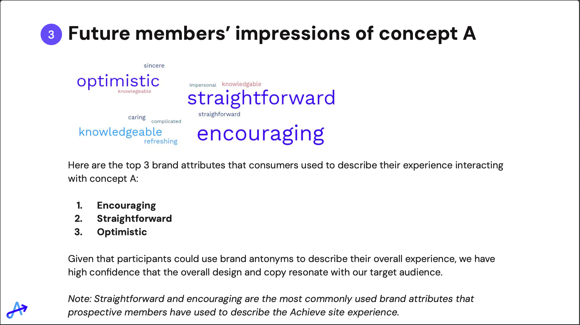
Tone test
About the test
• Test/content type: Unmoderated test to determine which information architecture best appealed to and was understood by participants and whether the voice and tone was on brand:
• Concept A with debt consolidation value propositions with 3 product options afterward
• Concept B shows the debt consolidation value propositions with a questionnaire to start a multi-product flow afterward
• Product: Achieve website
• Tools: Usertesting, Figma
What I did
• Wrote and prepared the two prototype variations in Figma
• Suggested questions to our UX researcher for the test plan
• Revised the copy based on our UX researcher’s recommendations and the user insights from the test
Impact of research
• Validated the voice and tone was on brand for the website
• Updated the copy based on user insights to highlight customized payment options
Feature naming test
About the test
• Test/content type: Unmoderated feature naming test to where research found “additional deposits” was the most clear term to mean "A deposit you can make whenever you have extra funds available, so that you reduce the time it takes for you to complete your program to get out of debt."
• Product: Freedom Debt Relief post-enrollment dashboard
• Tools: Usertesting, Google Inspect & HTML (to change the live text to variations)
What I did
• Prepared the screen shots of
• Created the test plan and questions
• Consulted with our UX researcher on the wording and flow of the test
• Set up and launched the test in Usertesting
• Presented the findings and gave recommendations to the stakeholder group
Impact of research
• Resulted in updates to the “how it works” content module explaining how the product works
• Validated the need to use the term “deposits” rather than “payments” for consumers trying to understand the product


User journey mapping
Mapping the whole journey from end-to-end.
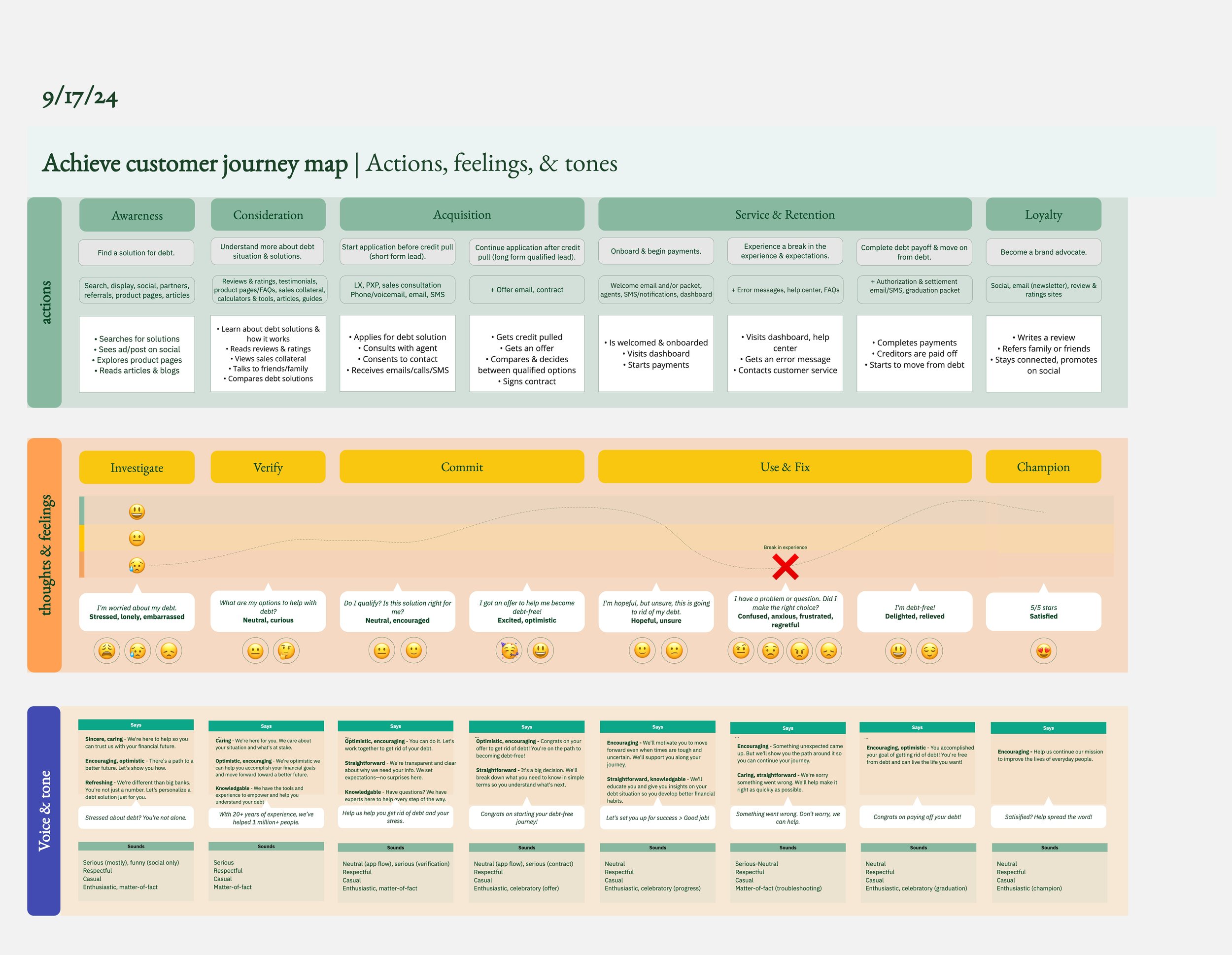
End-to-end journey map - Achieve company-wide map: Before design team feedback
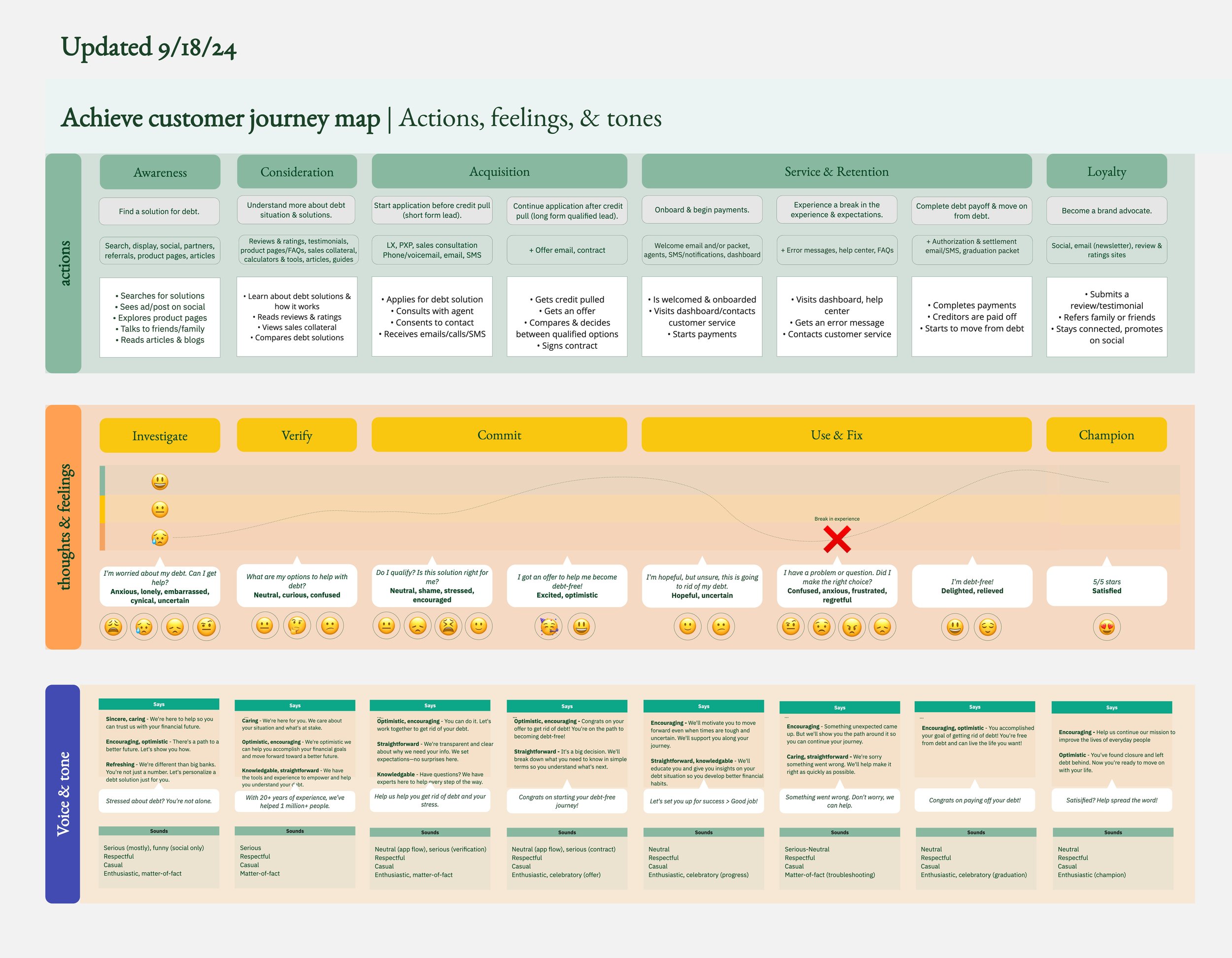
End-to-end journey map - Achieve company-wide map: After incorporating design team feedback

Story map - Money Left Over (MoLO) flow for launch
Information architecture
Creating a structure with clear content hierarchy and storytelling.

Freedom Debt Relief enrollment flow Terms page

Freedom Debt Relief enrollment flow Terms page

Freedom Debt Relief enrollment flow Terms page where the new structure has anchor points where user eyes can better scan the page.
Mobile apps
Content designing and UX writing for native mobile apps.

Before - GOOD (Get out of Debt) app onboarding flow

After - GOOD (Get out of Debt) app onboarding flow
Design system
Creating documentation, guidelines, and standards to ensure consistent look and feel from start to finish in the user journey.
I wrote accessibility guidelines for our Ascend Design System that included WCAG requirements and best practices like color contrast and labels for form fields.
I collaborated and reviewed with the Ascend Design System team and Accessibility Council to ensure the accessibility guidelines were consistent with WCAG requirements and the design system.

Accessibility
Making more accessible products possible and practicable through improvements in our processes and workflows.
I was a member of the Accessibility Council at Achieve, where I led efforts to establish accessibility processes through the creation of accessibility guidelines, checklists and toolkits. Here is where we gave a Tech Talk on the importance of accessibility and guidelines on how we build accessible products.


Here's an example of the brand guidelines where I wrote best practices for accessibility.

Here's an example of the brand guidelines where I wrote best practices for accessibility.

Here's an example of dynamic alt text I wrote for data visualization. I confirmed with product and development that we could tailor the alt text based on the user result.

I put together accessibility guidelines in a doc where the Accessibility Council collaborated before we started to incorporate them into brand and design system guidelines. This also became key for what eventually became the Accessibility Checklist for design.
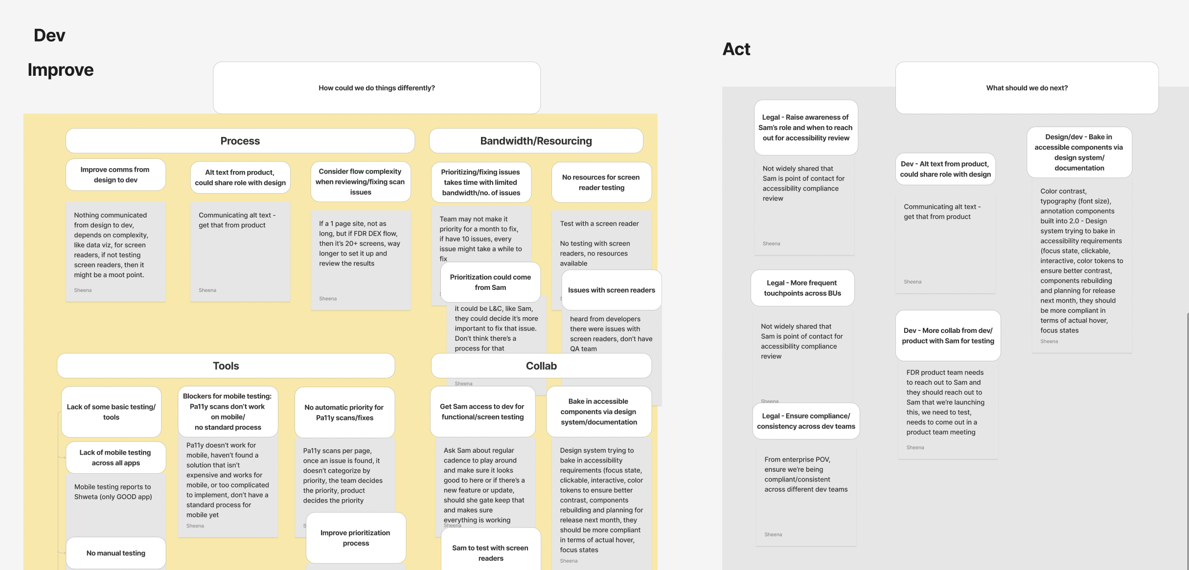
In order to improve accessibility overall and our design and development processes, I interviewed representatives from design, development, product, legal & compliance on their current accessibility processes. My interviews uncovered gaps and risks in current processes. I envisioned an accessibility toolkit (inspired by IBM) that included an accessibility checklist.
This is what the Accessibility Checklist looked like before I looked at the gaps for requirements and "nice to haves." It was missing key elements like requirements for form fields.

This is what the accessibility checklist looked like after I reviewed and confirmed WCAG requirements vs. what were best practices. I worked with the Ascend Design System team, including the head designer and developer, and legal & compliance to update the list. This updated version not only included visual requirements, but also requirements for content, readability, labels, and links for better accessibility.
In addition to the accessibility checklist, I wrote accessibility guidelines for our Ascend Design System that included WCAG requirements.
I've consistently tried to improve accessibility in products through improved processes. For example, I hosted a Design Crit & Share meeting where I asked the design team what they would name icons so we could develop consistent alt text for functional icons.

Here's an example of component-specific guidelines that I wrote for accessibility.
I made a tool where designers, developers, and others could easily create their own alt text descriptions for data visualizations by filling in the blanks.