ACHIEVE.COM DEBT CONSOLIDATION
Creating a product page that encompassses all loan and debt solutions—and eventually becoming the site’s top performing page with a session to multi-product flow of 38.7%.
OVERVIEW
Role
Staff UX Writer
I was the primary writer and worked with a designer, 3 brand managers, and PM to create a new page that featured all 3 core products for the company.
Goal
Encourage users to learn about Achieve.com’s debt consolidation solutions, fuel organic traffic growth for “debt consolidation,” and improve visitor to lead conversions.
Impact
14.7% lead per session
the best performing page for that metric on Achieve.com at the time.
PROBLEM
How might we engage and educate users on debt consolidation—including for one product that surprisingly consolidates debt?
The site needed a new product landing page for debt consolidation that
• Educates users on 3 products (debt relief, personal loan, home equity loan) as solutions, which could be difficult because people don’t think of debt relief as a way to consolidate debt
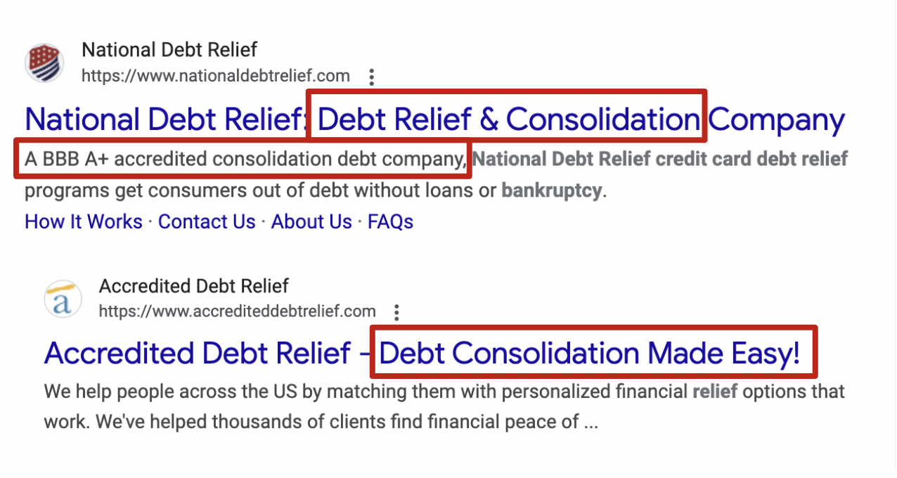
• Targets debt consolidation keywords that competitors rank for, but not our company
PROCESS
Focusing on principles
Findable
• Fill in page gap so users can find us for search term “debt consolidation” and get relevant information about simplifying their debt payments
Clear
• Make sure content is clear and concise so people quickly understand how debt consolidation helps them
Helpful
• Create content to help people who are struggling with making multiple payments for their credit cards and loans
1 Discover
Solving user pain points around confusion and distrust
User pain points:
• May qualify for a consolidation loan, but not sure which loan to get
• Unaware or wary of debt relief as a debt consolidation solution
Questions asked:
• How might we educate users on the benefits of debt consolidation?
• How might we structure the page (information architecture) to best communicate product value and messaging?
“Stability Seekers - neutral to negative cash flow, lower financial competence
Anxious Anticipators - neutral to negative cash flow, higher financial competence”
Pinpointing the most relevant information and which solution is best for users’ financial situations
• Before even writing the content, I interviewed 3 brand managers for 3 products (debt relief, personal loan, home equity loan) to learn what are the differences and similarities of all the product features
• I wanted to understand how to best help users to make a choice between all 3 products, especially if someone qualifies for every product in the multi-product flow down the line. In talking to the brand managers, I highlighted what made each product the best for some users depending on their personal situation.
Creating visual boards to learn and compare information
• Whenever I have a new product to learn, I like to create visual boards in Miro or FigJam where I can list out features, benefits and other important information. Here's a Miro board comparing the 3 financial products
2 Strategy
Considering user intent and goals
• Prospects with good credit scores who seek debt consolidation may have hard time deciding between all their options
• Prospects may not have heard of one or more of these 3 options and need further education
Voice and tone
• Encouraging
• Straightforward
• Optimistic
Developing concepts to test
• I worked with brand to develop two test concepts with different information architecture (IA):
1. Concept A features a value prop section and then our 3 product options for debt consolidation
2. Concept B shows a value prop section and then a debt consolidation form module
3 Research
User test revealed lack of social proof, too much content on mobile
Wrote A/B copy for content test and suggested test plan questions:
Insights:
• Participants expected to see social proof (Trustpilot) that was missing
• ~50% of participants thought that there was too much content on mobile
• Users were confused whether debt relief was a loan
• Messaging for custom offers and payment plans resonated with prospects
Testing different content structures, messaging
• Worked with our UX researcher to test copy that had different information architecture, value props, CTAs, tones, and more
• Suggested questions for the test plan so insights helped refine the structure and copy
Validating brand voice and tone
• UX research validated the voice and tone of the test copy. The encouraging tone was important to motivate users to explore their options, the straightforward tone is important to educate prospects effectively about financial products that could seem complex
Finding what value props were most important to users
• Test results showed the top value props that were later used to help determine the order of the value prop section in the design
Incorporating the insights and refining copy
• Later incorporated test results into the final copy including top value props and their order, and a FAQ on customized plans
4 Iterate
Refining content to reduce copy and focusing on the most important value props
Content design:
• Went forward with concept A information architecture, the winning concept where prospects will see the product information first before using a tool to find the best solution for them
• Added FAQ on how to customize payment plans based on user interest
UX microcopy:
• Reduced copy in headings and descriptions
• Wrote clear and actionable headings
• Emphasized custom plans value prop (No. 2 most appealing from UX research) through CTA button copy like “Customize your plan”
Deciding on the winning concept
• Went with concept A information architecture (IA) based on research findings
Refining the content based on the research
• Iterated on copy including order of value props, added CTA button copy like "Customize your plan" to highlight No. 2 most appealing value prop (Customized payment plans)
• Went through multiple stakeholder rounds of feedback, including with the Co-CEO and brand VPs, director, and managers.
5 Handoff
Compliance review & dev handoff
• Facing challenges of whether debt relief is a debt consolidation product or not, I initially prepared prototypes where
1. debt relief was in the same product section as loan products 2. debt relief was separate
• Legal & compliance decided debt relief was debt consolidation so I used the prototype where there was only one product section
• Used compliance doc as a source of truth for final copy for dev handoff
Handing off the final version
• Created a compliance document for compliance review to note the before and after copy changes
• Compliance docs are often used as the source of truth for final copy for our development team
Launching the live version
• Here’s the live version on the site: https://www.achieve.com/debt-consolidation
OUTCOME
Before
Debt consolidation page - wireframe
❌ Participants were confused or questions around fees, credit impact, and more
❌ Some value props like “Personalized expert help” did not resonate with participants without context about their expertise
After
Debt consolidation page - live
✅ Clarified confusing content to improve understanding about products
✅ Session to multi-product flow 38.7%
✅ Direct to multi-product flow is 33.9%
✅ Lead/session is 14.7% - best on Achieve.com at the time


