GET OUT OF DEBT (GOOD) APP
Improving the GOOD app store and in-app copy with clear and motivating language to achieve a +200% enrollment rate, 68% conversion rate in the App Store, and double leads to 14%.

OVERVIEW
Role
Staff UX Writer
I worked with the brand and product team to update design and messaging for app store screens and a UX designer for in-app updates.
Goal
• Increase download rate by delivering clear, succinct app store copy and compelling visuals.
• Increase digital enrollment experience (DEX) start rate, credit and PII pull through rate, enrollment rate.
Impact
• 68% conversion rate App Store vs 5.8% personal finance app average
• 79% conversion rate Google Play vs 27-37% personal finance app average
• Up 58% for in-app credit page pull through
• Doubled leads at 14%
PROBLEM
How might we improve the one-dimensional app store experience and encourage users to complete sign up?
The problem with the Get Out of Debt (GOOD) app was two-fold:
• The app store screen design was one-dimensional and had messaging that only focused on features, not user benefits


•The onboarding flow was too long and pull through declined with the increased friction. The screens lacked compelling value props that would help complete sign up. Pull through declined where only 17% had gone through the credit pull stage.
PROCESS
Focusing on principles
Clear
• Write clear and concise content for the app store that would motivate and encourage users to download the app
Connected
• Engage users through updated app store copy and visuals and prepare the users to complete sign up
Human
• Add emotional benefits to app store copy and micro testimonials from real customers during onboarding so users feel optimistic about signing up

How I worked
Collaborators
• UX designer
• Brand designer
• Brand writer
• Product manager
• Legal & compliance officers
• Brand director
• VP of brand
• VP of content
Work I did
• Copywriting for app store and product landing page copy
• UX writing/content design for in-app onboarding content
• Competitive analysis of app store competitors
• Multiple messaging options to A/B test in the app store
• Legal & compliance tickets and documents
Skills/software used
• Figma
• Google suite (Slides, Sheets) for SEO research, compliance documents
• Divvy (legal & compliance tickets)
1 Discover

Uncovering user pain points that add to the friction
• The past app store visuals had a low number of downloads
• The visuals were not compelling or engaging enough for the recently launched app
• Users were not prepared or did not expect to start a debt plan in the app, which adds to the friction that degrades pull through rates as they were expected to complete a long onboarding flow
“Stability Seekers - neutral to negative cash flow, lower financial competence
Anxious Anticipators - neutral to negative cash flow, higher financial competence”
2 Strategy

Increasing trust and motivating users with value-driven messaging
For the app store, I had an opportunity to create 3 versions of content that varied in messaging depending on user goals:
• V1 -Get rid of debt, how the app works messaging.
• V2a - Get out. of debt faster with help from experts with trust markers.
• V2b - Get out. of debt faster with help from experts with more reviews.
For the onboarding flow, I focused on value-driven messages in addition to a compelling data visual that helped motivate users to continue sign up. In addition I wrote micro testimonials of successful customers displayed at the very beginning of the sign up flow that could become aspirational for new users.
Voice and tone:
• Encouraging
• Straightforward
• Optimistic
Mapping out desired app store messages
• Confirmed desired messages from the product manager. Expanded on messages to include functional and emotional benefits.

Performing competitive analysis of app store visuals
• Performed competitive analysis of other app store visuals and videos. I used FigJam to collaborate with the brand designer on the team.

3 Research

Designing content based on user questions
While the team didn’t have time for research, I did pull from previous research for a different personal finance app to influence the copy.
Most appealing features include:
• Clarity around where your money is going
• Personalized notifications
4 Iterate
Refining the messaging concepts

Content design
• Strategized messages for the 3 different versions of the app store screens
• Determined order and progression of the screens for the different variations
UX microcopy
• Wrote main message and headings
Working on the wireframes
• Worked with the brand designer to come up with the wireframes for the messaging concepts

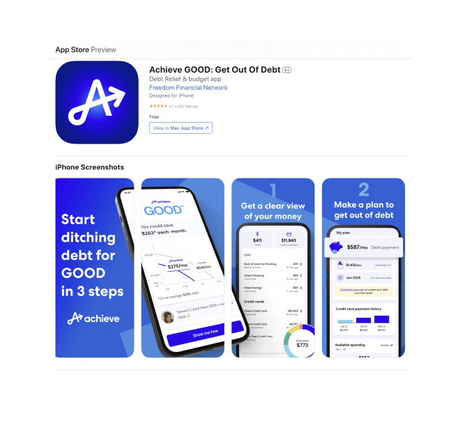
Strategizing the 3 messaging concepts - V1 (3-step how it works)
• Main message was getting rid of debt and a walkthrough of how to create a custom debt plan, highlighted emotional benefits, expert help message was secondary

Strategizing the 3 messaging concepts - V2a (expert help you can trust)
• Main message was about getting out of debt faster with help from experts, featured trust markers like $X debt resolved, screens highlighted features

Strategizing the 3 messaging concepts - V2b (expert help without trust markers)
• Main message was about getting out of debt faster with help from experts, featured more reviewer quotes vs V1

All 3 concepts together
Lacking compelling reasons to move forward and complete signup
• In the original flow, the tone and content was straightforward. There were very few reminders of the value props of the app to motivate them to finish signup.

Sparking optimism when looking into users’ debt-free future
• In the updated flow, the tone is optimistic and encouraging in describing how much they could save in the chart. I suggested we use aspirational micro testimonials to complement this positive tone and to give users a glimpse into their debt-free future. These new components—combined with value-driven copy about personalized solutions in the most critical pages like the credit pull through page and transition pages—helped reduce the friction in the original flow.

5 Handoff

Handing off to compliance and dev
• Provided compliance doc and links to reviews mentioned in the testimonials as substantiation for legal & compliance review
Reviewing with compliance
• Revised copy based on legal & compliance of what was too promissory or misleading

Handing off the final version
•Updated the copy based on stakeholder feedback and simplified the copy and segmented the emotional benefits (Reduce debt & stress, Simplify your life) into separate screens to illustrate the benefits more effectively

Results of A/B testing the 3 concepts
• Selected V1 as the winning concept after testing, which prepared users for creating their get out of debt plan
OUTCOME
Before
GOOD app - before
❌ One-dimensional, wordy descriptions in the app store
❌ App store visuals focused on only features for every screen rather than emotional benefits or member testimonials
❌ Onboarding flow was too long and pull through declined with the increased friction
❌ Leads rate 7%
After

GOOD app - v1.18
✅ After testing all 3 versions, V1 (how it works steps, emotional benefits message, and testimonial) was the winning version out of 2a and 2b.
✅ Updated to encouraging and motivating tone, added emotional benefits like “reduce debt & stress” to complement feature descriptions
✅ Credit page pull through up by 58% with new value props
✅ Leads rate doubled at 14%, +200% enrollment rate
Feedback

— Radu, Principal Product Manager, Achieve